Archive
Keep My Voice
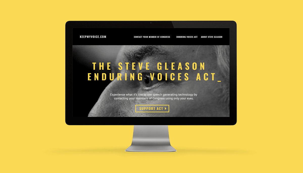
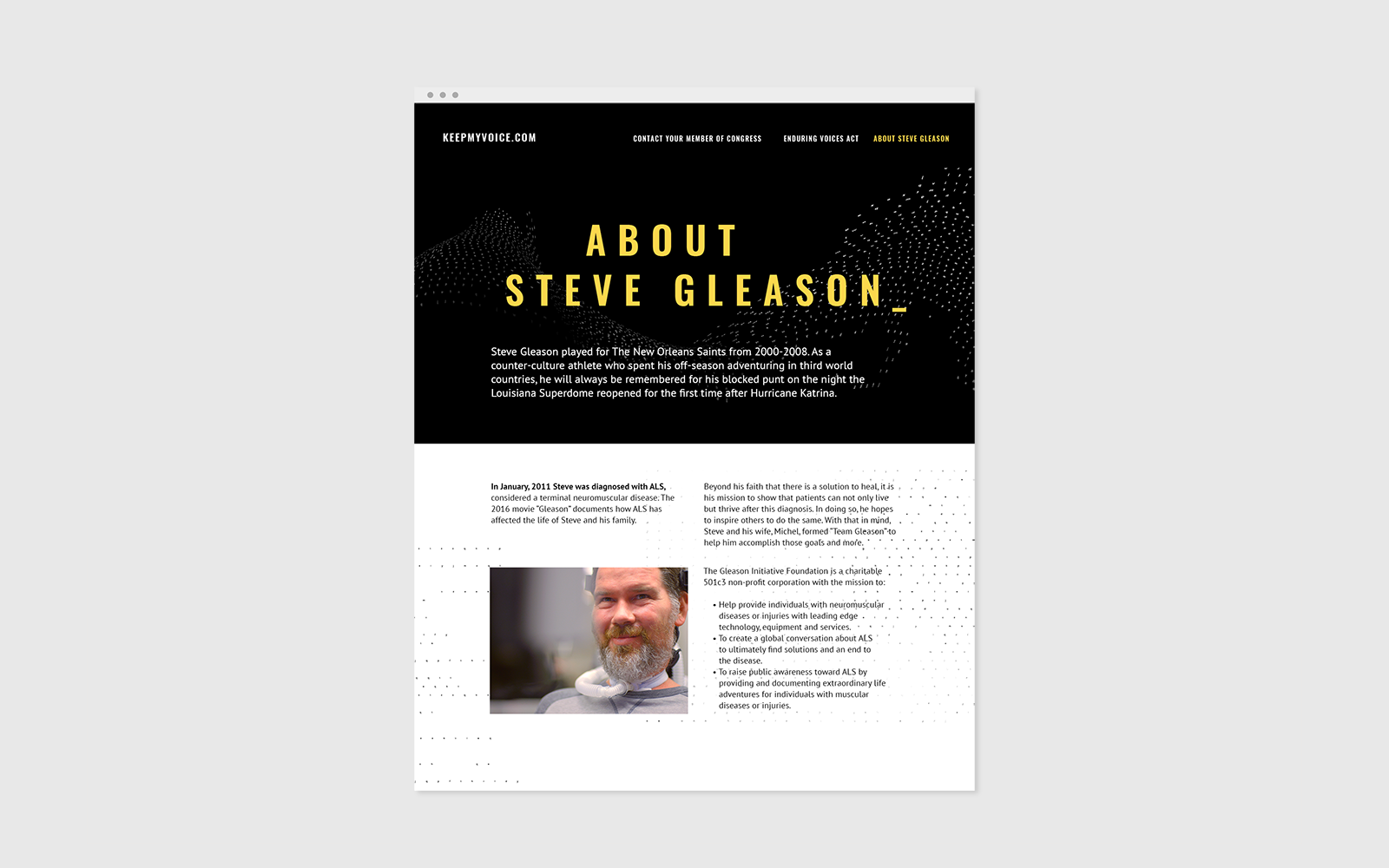
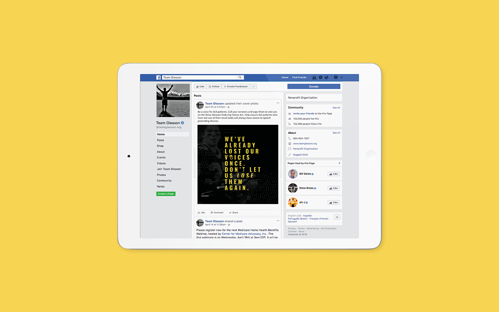
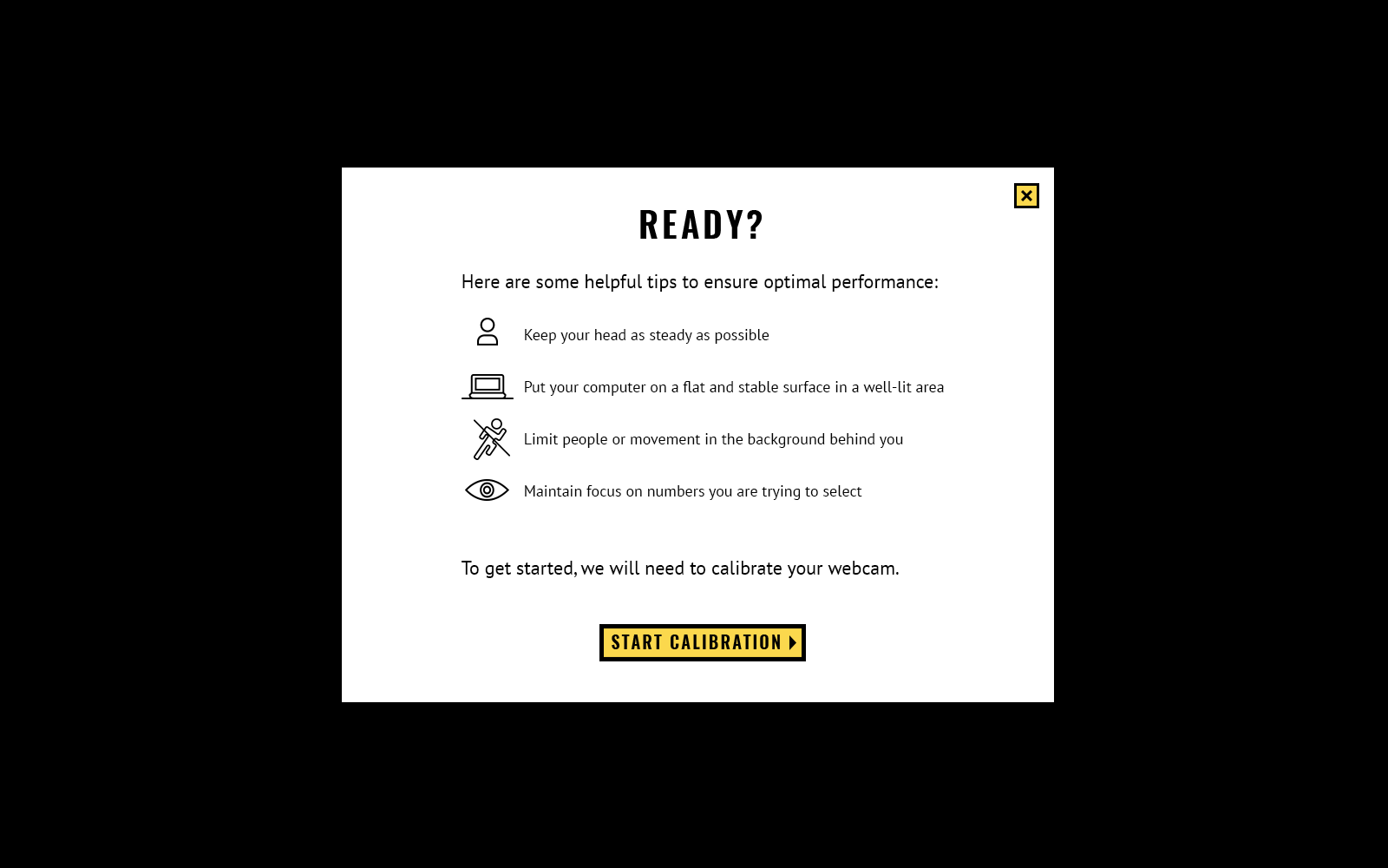
Ogilvy developed a powerful campaign to support the Steve Gleason Enduring Act, a measure that ensures ALS patients access to a speech generating technology. We had people with ALS make 'robocalls' to Congress, a similar tactic that politicians use to reach supporters. Along with the video campaign, we built a website with a demo eye-tracking technology that could be used to send messages to the members of Congress. My role was to design the brand look & feel for the campaign and the website in a bold and visually impactful way.
Agency: Ogilvy
CD: Sam Spratlin, Estee Mathes
AD/ Design: Tracy J. Lee
UX Art Director: Mary Fran Wiley
Developers: Matt Andrade, Zack Pirrello


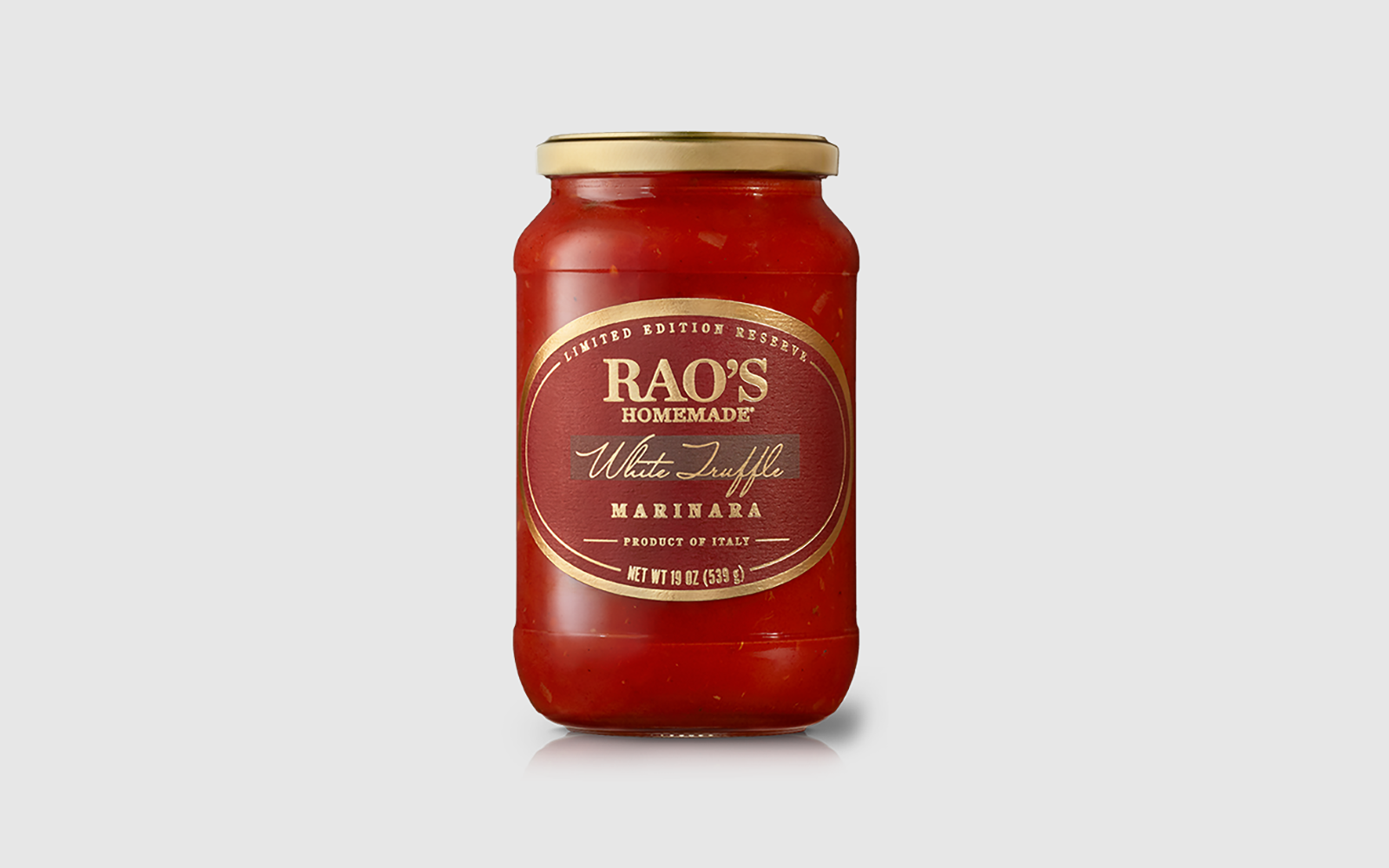
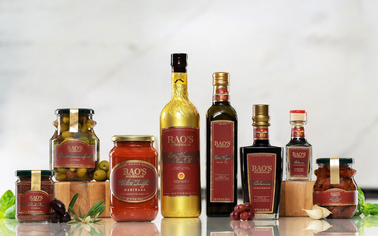
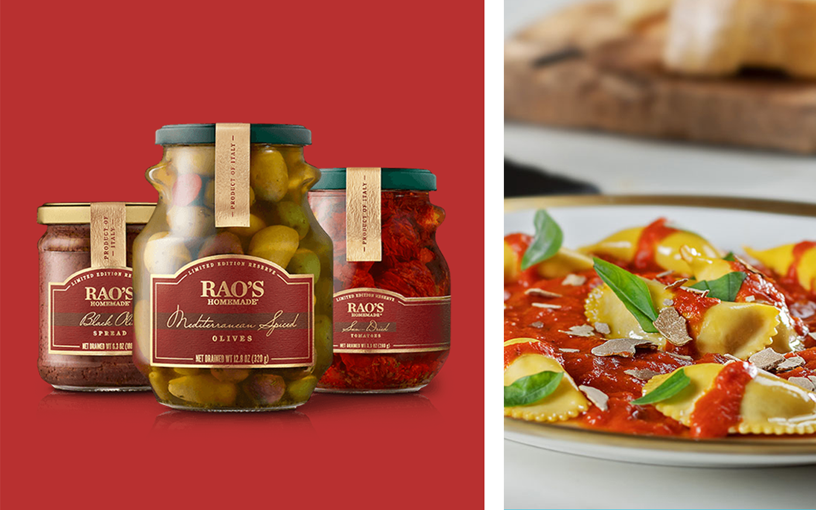
Rao’s Limited Edition
Rao’s Homemade is a premium brand with an extremely loyal following. The Rao’s Homemade® Limited Edition Reserve was launched to promote an even more elevated perception of the Rao’s Homemade brand while maintaining a strong connection with the core Rao’s sauce label and brand equity.
Agency: Hatch
CD: Nicole Flores
Design: Tracy J. Lee

Noosa Drinkable
Package design for noosa's new fruit smoothie yogurt drink. We aimed to captivate established noosa customers and push them into a new on-the-go product offering. Our design feels joyful and approachable, amplifying taste cues through vibrant illustrations and colors.
Agency: Hatch
CD: Nicole Flores, Max Churchill
Design: Tracy J. Lee

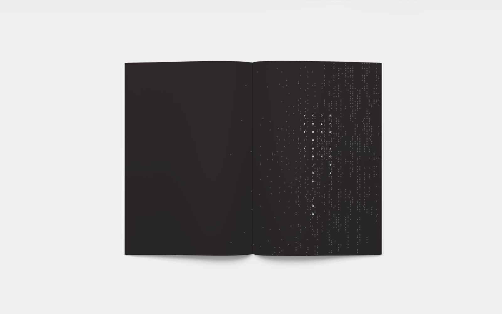
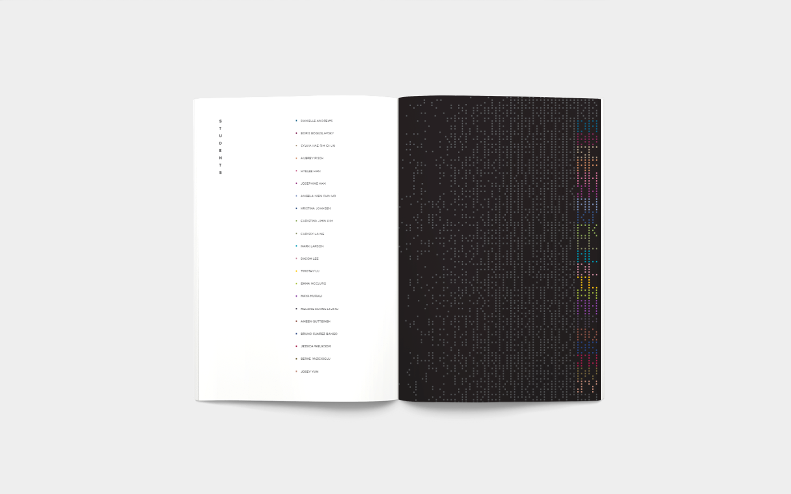
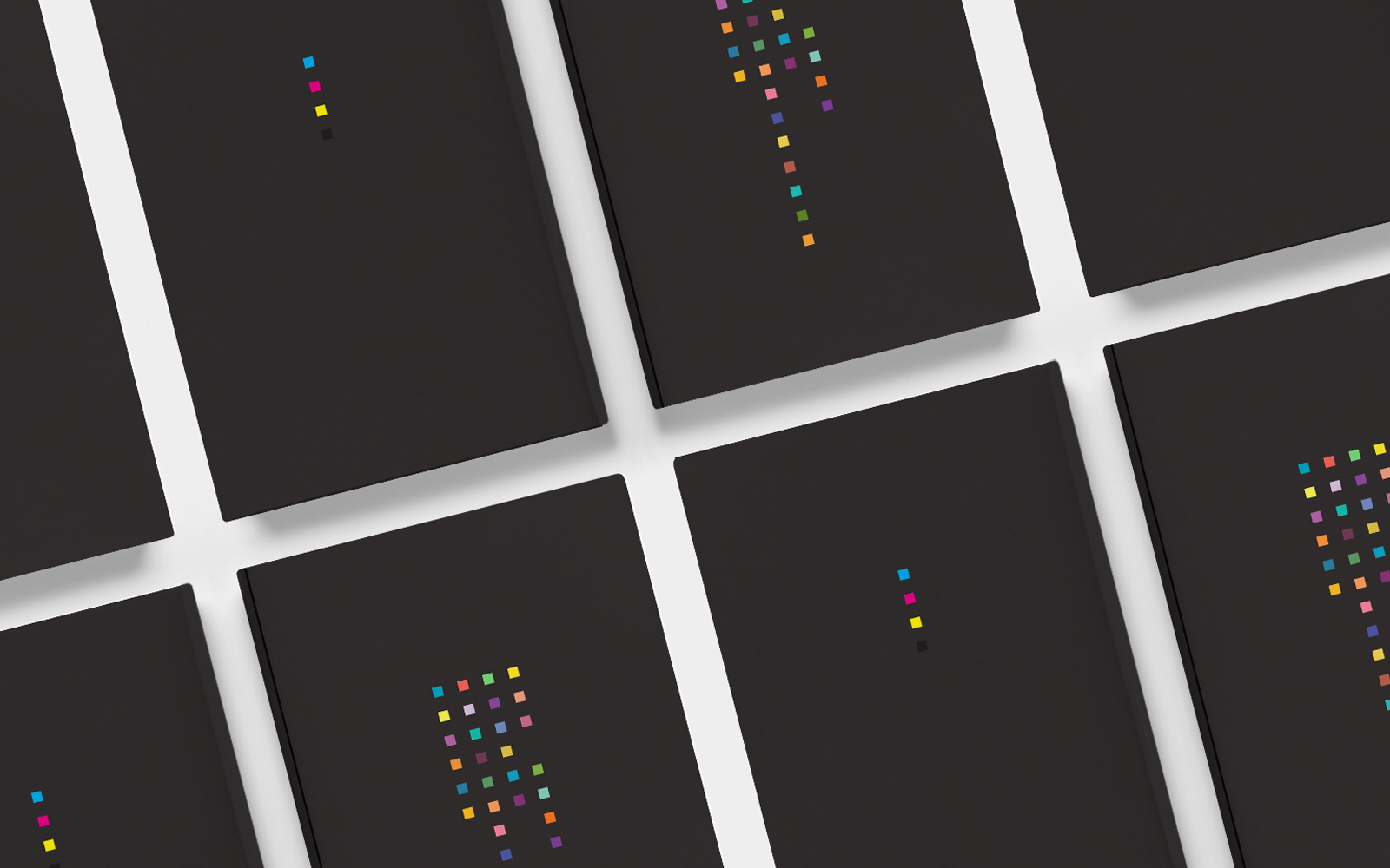
SAIC VCD 2015
The concept of the book explores the idea of the Visual Communication Design department as DNA, representing student’s creativity and individuality. Like the dynamic structure of DNA, we constantly seek new possibilities through our design process.
The four-letter code used to describe DNA is re-envisioned as Cyan, Magenta, Yellow, and Black (CMYK), the four print-based colors used to create innumerable color combinations. These basic building blocks that represent our individuality not onlymake our department unique but also a unified whole. A simple formula was devised to express this idea by assigning each student a unique color. Each letter of the alphabet was assigned one of four colors. K was assigned to the letters least used, for it can easily overpower the others. C, M, and Y were assigned, in alternating order, to the remaining letters, although Y was applied to extra letters as it is a somewhat recessive color with a lighter chromatic value. The percentage of each color was set to 15, representing our class year.A color aggregate based on the letters in students’ names determined their unique colors.
Client: School of the Art Institute of Chicago
CD: Mark Stammers
Design: Tracy J. Lee